
re:discover
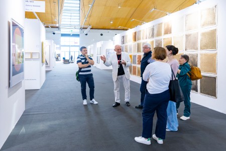
We are very pleased to be able to present a completely new format in 2024, which also builds on the particular strengths of art KARLSRUHE: the re:discover support booths.
Together with the Bundesverband Deutscher Galerien und Kunsthändler e.V. (BVDG) and supported by the Federal Government Commissioner for Culture and the Media (BKM), art KARLSRUHE aims to give visibility to artists in the art market who, despite the high artistic quality of their work, do not currently receive our attention.
20 juried galleries will each present an artistic position as part of this funding programme. Questions will be raised about the significance of the work of visual artists for the present and in a historical context. At the same time, re:discover takes a contemporary look at the themes of legacies, pre-legacies, older works and the mechanisms of the art market.
Supported by:
With this newly created section, we would like to enhance the qualities of art KARLSRUHE in a special way and establish a format that is unique at art fairs.
re:discover artists 2024 (author: Karlheinz Schmid)
Born in 1942, Peter Benkert was a master student of the informal painter Fred Thieler in the late 1960s, so it comes as a surprise that Benkert numbers among the artists of the Concrete faction. Benkert’s work, which he says is characterised by “geometric hard-edge abstractions” and “unreal constructions”, leaves no room for doubt: his colour series and space probe paintings create a pictorial cosmos that simultaneously addresses orderliness and informality. And it is no coincidence that this constructivist also speaks of dangers and threats when he localises his painting vis-à-vis a world that seems to be falling apart at the seams.
As a young artist Peter Benkert, along with Karl Horst Hödicke and Markus Lüpertz, was one of the initiators of the legendary Berlin-based exhibition group Grossgörschen 35, yet he always remained true to his vocabulary. From the “Luschen” that he created some 55 years ago to the “Sonden” from this century, Benkert’s pictorial spaces are strictly organised, yet allow for deviation and disconcertion. Whether realised with acrylic on canvas or car paint on pressboard, it is clear that “what appears to be incompatible in terms of content” (Benkert) nevertheless has “inner connections and continuities”, although this phenomenon is recognisable only at second glance.
Notwithstanding diverse exhibitions and acquisitions (including the Daimler Art Collection), the fact that this artist has not yet been able to enjoy the success he deserves may be explained by his oeuvre per se, which is not primarily aimed at the visually pleasing, but seems committed to an inner truth. Not yet been able to earn a living from his work, this painter worked for decades as a teacher and also as a librarian. The fractures and distortions of my real life”, Benkert says, “were certainly also a cause of the paradoxes of my painting.”
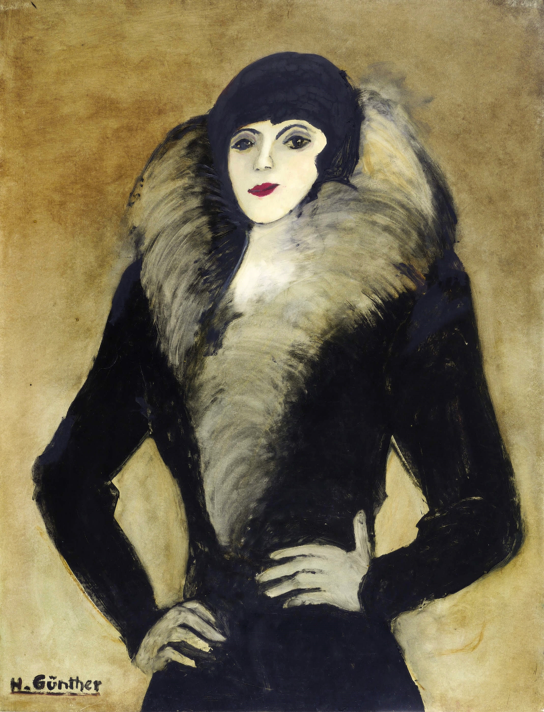
Whether it is the “Waiting Woman” (2007) or the woman in the pastel “Café” (2000), whether it is “Streetwalk” (1990) or “Fairground” (1990) without the expected hustle and bustle, a melancholy and thought-provoking mood characterises Herta Günther’s representationally orientated, expressionistic motifs. The characters and settings in the oeuvre of this painter and graphic artist, who was born in Dresden in 1934 and died there in 2018, bear witness to a certain dreariness. But this melancholy, rather than repulsing its viewers, arouses their curiosity about the depicted people and the circumstances of their lives. The everyday and supposedly familiar always seem perplexing and somewhat strange here.
Whether portraits or cityscapes, there is no doubt that Herta Günther’s work cannot be viewed without a sidelong glance at Otto Dix, George Grosz and Christian Schad. Her penchant for coming as close as possible to her characters is also evident in her paintings. Trained by Hans Theo Richter and others in Dresden in the early 1950s and closely associated with the medium of printmaking from the beginning of her career as a painter, Herta Günther found an unmistakable form of representation thanks to her surroundings, nourished with narrative elements that arose in part from study trips to Bulgaria, Hungary and elsewhere. Autobiography colours her art.
Although she can claim various success, including participation for two decades in the GDR’s prestigious art exhibitions in Dresden as well as taking part in the Biennale of European Graphic Art in Baden-Baden more than forty years ago, Herta Günther never experienced an international breakthrough during her lifetime. However, renowned museums in eastern Germany, where she exhibited since the 1970s, including Chemnitz, Dresden, Halle and Schwerin, document that Herta Günther’s estate indubitably deserves recognition by a large international public.
.jpg)
When it came to the question of what characterises her work, Ingrid Hartlieb, who was born in 1944, had already experienced resistance as one of Rudolf Hoflehner’ students in Stuttgart. In the 1970s, she numbered among the few women artists who were obliged to assert themselves against male colleagues in the male-dominated sculpture scene, but it was her special approach to her material that soon challenged her. Already as a young sculptor, Hartlieb had dedicated herself to wood: she split and sawed huge blocks, then re-layered and glued them together in an ongoing process of healing and a ceaseless effort to create the optimal form.
As expansive structures evoking the process of their creation, these sculptures have a distinctly archaic aura. Ingrid Hartlieb’s characteristic tendency towards the monumental reaffirms the inherently existential dimension of her oeuvre. This artist sometimes works with nails, staples and sheet metal, combining different varieties of wood such as beech, oak and larch, to lend a richly textured form to her often organic-looking, layered creations. Preliminary sketches prepare her for the forms, which undergo modifications in their sculptural realisation, as is inevitable when a sculptor “listens” to her materials and observes them attentively.
Hartlieb’s sculptures often bear titles (such as “Eye-catcher”, “Family Tree” or “Straitjacket”) that convey her intense, honest commitment to each work of art. This enables viewers to absorb the true power of these wooden artworks, some of which weigh several tonnes, as mental energy and invites beholders to contribute their own feelings and experiences. This is a special kind of exchange, somewhat overshadowed by the sadness that Ingrid Hartlieb feels despite her early successes. In recent years, she says, she has no longer been truly recognised.

Dirk Hupe, who was born in Essen in 1960 and died at a relatively young age in 2021, was an experimental mixed-media painter who combined informal and conceptual approaches. Resisting a hast and superficial gaze, these pictures initially lure their viewers onto informal terrain, only to disconcert their beholders, perfidiously in the best sense, with constructive sprinkles and to catapult viewers out of familiar modes of reception. Hupe’s art calls for close scrutiny.
The examination of writing is a common thread running through his entire oeuvre. Dirk Hupe, who studied German and philosophy in Düsseldorf and graduated with a degree in design from the University of Duisburg-Essen, mistrusted the letters of the alphabet as carriers of information and developed new meaningful content from their forms, which in turn triggered diverse refractions and modifications. The cycle recurs on several levels, from the painterly gesture to work on a computer.
A penchant for deconstruction, although not dedicated to the dissolution of concepts as an end in itself, characterises the paintings, objects and installations of this artist, who studied under Lászlo Lakner and others and later taught in Dortmund, Essen, Mülheim an der Ruhr and Witten/Herdecke. A master of fragments and signals of constant self-questioning, Hupe made traces of his analytical approach presentable via residual and leftover signs, as he called some of his works.
Born in 1941, Dieter Jung is a pioneer of holography and thus ultimately a trailblazer of an artform that was subsequently catapulted into the digital age through the untilisation of computers. This Berlin-based artist, who studied theology and film as well as painting and graphic art, first began to make light and movement possible in his visual work in the mid-1960s.
He professionalised his knowledge during the following decade in New York, for example, at the School of Holography, where laser beams were used to create the first text holograms, which visualised thoughts by Hans Magnus Enzensberger. The late light and ZERO artist Otto Piene, a friend of Jung’s, lauded his virtuosity and called him “a light magician, a holographic magician, a peace magician”. This conjurer’s technically charged inventions never become trapped in a formal perceptual grid, and instead encourage their recipients to gaze behind these beautiful, poetic-looking artworks and grasp their deeper meanings.
The open-minded, cosmopolitan light artist Dieter Jung engages with the reality of the present day without the slightest tendency towards illustration, which, as he says, constantly surprises him. In keeping with the global situation, which is fraught with crises and wars, he naturally also occupies himself with the darker sides of reality, which challenge him because of their injustice and unclarity. Stripping away the veil of perception and ensuring transparency in the multidimensional are the tasks that persistently challenge Jung in each new artistic endeavour.
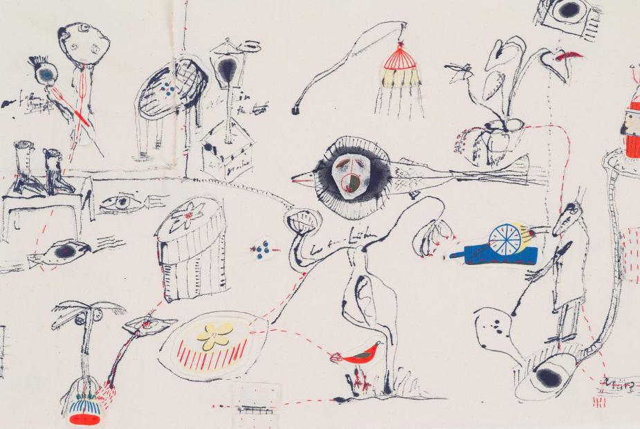
Nude and armed with a bow and arrow or hot on the trail of a voracious lawnmower in horizontal stripes: on closer inspection, such supposedly mundane motifs of figurative painting seem to harbour a secret, an inviting message that recurs throughout this artist’s broad repertoire of themes. Born in 1953, Norbert Kiby studied painting in Karlsruhe in the 1970s and learnt from the outset not to shy away from figuration.
Little Red Riding Hood, the Amazonian archer and the lawnmower ultimately serve the goal of finding and shaping Kiby’s own identity in painting. In the process, this artist, who was awarded the Lukas Cranach First Prize by the city of Kronach in 1998 and who now richly deserves rediscovery, ventures boldly into areas that most of his colleagues prefer to avoid, probably for fear of failure.
Favouring saturated colours and vivid shapes, Norbert Kiby dares to tread a fraught terrain. Although his paintings are sometimes labelled “pathos” and some critics opine that he does not shy away from kitsch, this painter remains largely indifferent to such verdicts. He is particularly interested in painterly density, intensity, and an art that can certainly be fun. His pictorial artefacts are said to be an aesthetic pleasure, and that is indeed the case. Beautiful views, cheerful views.
Whether the themes are historical, religious or literary, to a certain extent they all serve Georg Kleefass, who was born in Budapest in 1962, as raw material for realistic paintings in the wake of the Leipzig School. The artist studied under Arno Rink from 1996 to 2002 and made a name for himself in the field of classical subjects, i.e. portraits, still lifes and landscapes that reveal an unmistakable delight in primary and complementary colours. Georg Kleefass is still waiting for his big breakthrough.
Perhaps the art market is not yet ready for a pictorial oeuvre that is inherently far removed from commercial interests. This certainly has something to do with the fact that Kleefass is inspired by the bold idea of summarily dissolving ubiquitous opposites such as beauty and violence or play and seriousness, which merge in these paintings, about which Kleefass says, “The question of how I can raise the contrast between two or more figures to the highest possible level is closely linked to my artistic and aesthetic approach and is incompatible with the question of moral sensitivity.”
The fact that this artist’s craftsmanship is extremely precise down to the smallest details probably has something to do with his initial training, which began in the 1980s. Kleefass first studied jewellery design at the University of Applied Sciences for Design in Schwäbisch Gmünd. Like many goldsmiths and silversmiths, there came a time when he was gripped by the feeling of wanting to conquer larger dimensions of form and content. Seen in this light, painting would seem to be an extremely suitable medium for illuminating complex issues via simple representationalism.
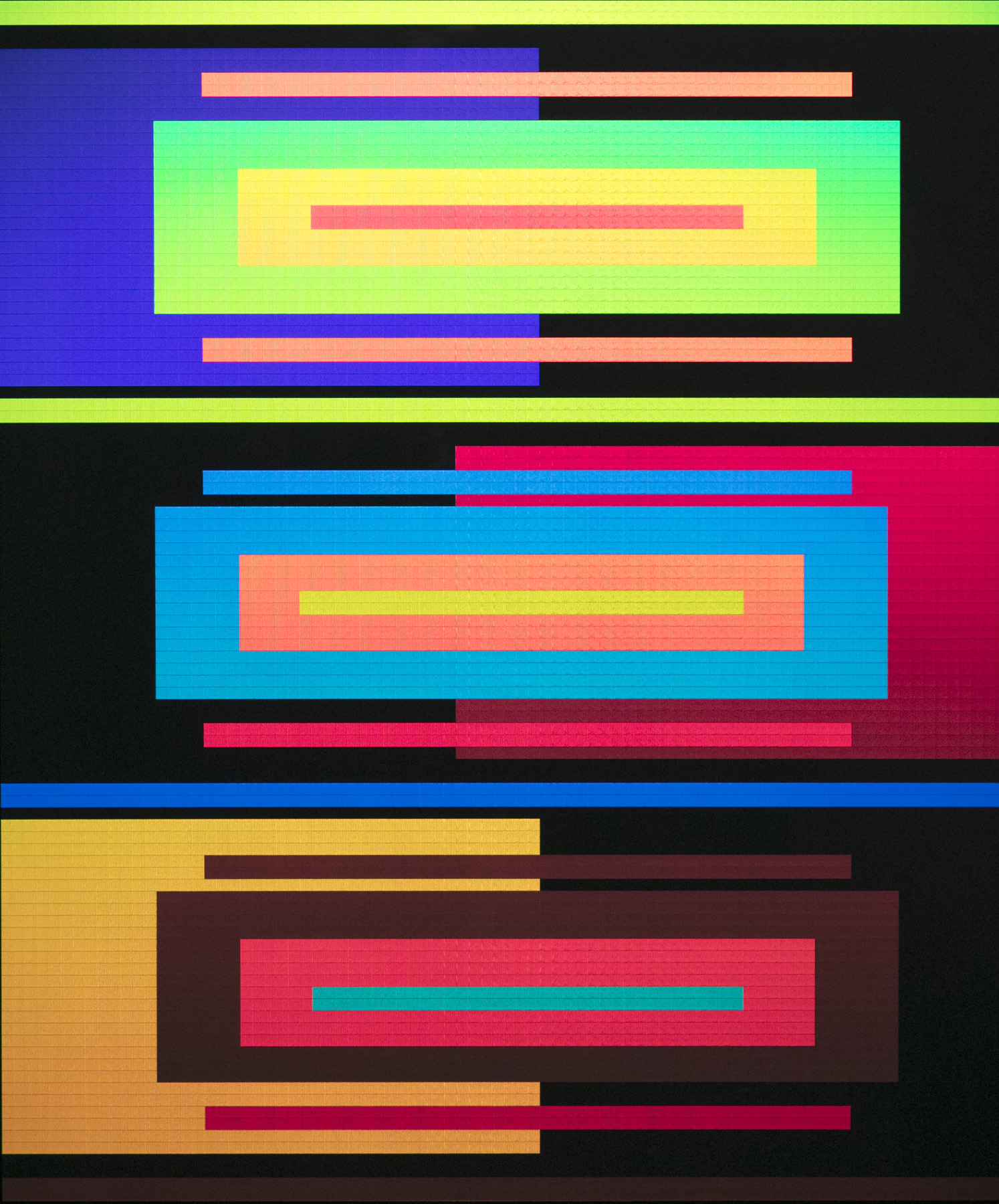
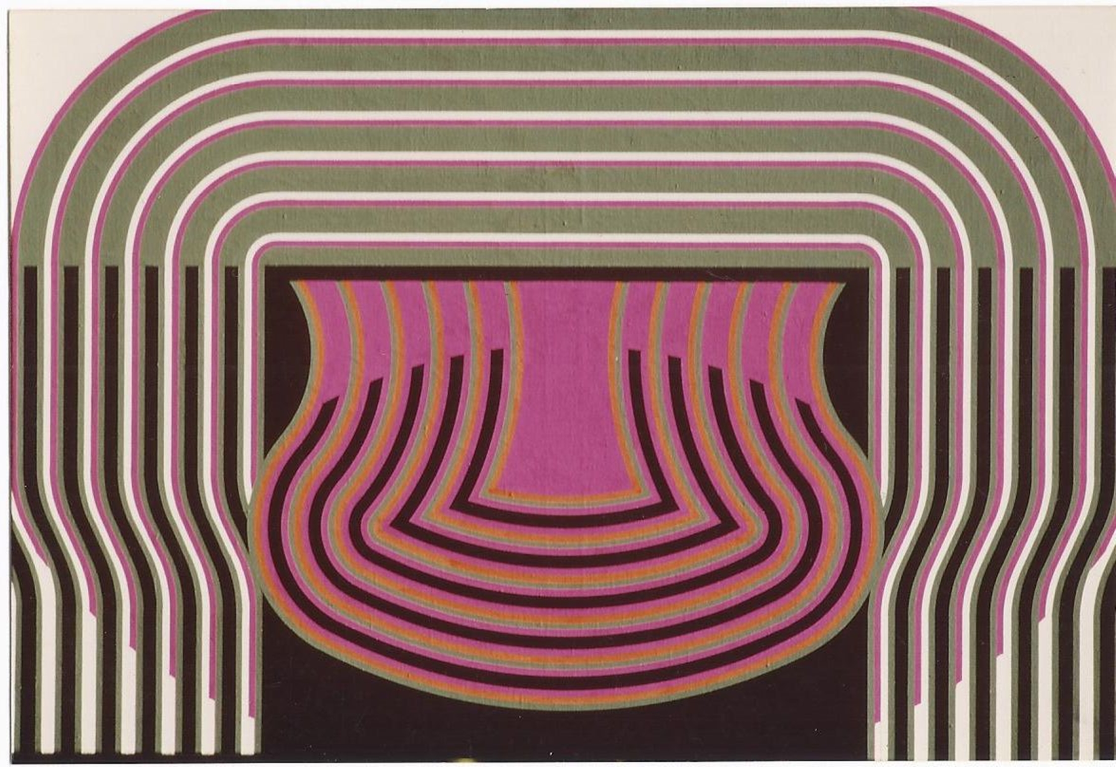
The vocabulary is familiar: circle, rectangle, square, often layered, overlapped or somehow crazy, occasionally interrupted by nuanced colourfulness or gradations, spatially set into a dynamic that creates rhythms and even promises mobility. Order appears in the seriality, but this is always overshadowed by a sense of what it might be like if the coloured squares began to dance and, now and again, yearned to rise up or flee sideways, thereby escaping, so to speak, from the pictorial space. Impending disorder in a structured game. A phenomenon, a Constructivist phenomenon.
Born in 1951, Frieder Kühner has been active in the genre of Concrete art since the seventies. He studied with Paul Uwe Dreyer and others, was one of the founders of the Konstruktive Tendenzen artists’ group, and his time as an employee in Anton Stankowski’s studio surely left its mark on him. It is no wonder that he is one of the serialists and that this painter, who has mainly exhibited in Baden-Württemberg to date, is no innocuous mould filler, but works courageously on models of thought and cognition, which are, of course, channelled into constructive paths.
This transformation often takes place on the basis of mathematical laws, in keeping with the fact that Kühner imbibes his artistic nectar from the sciences. Even if op-art effects are occasionally apparent, sometimes even obviously so, the viewer of these pictures is always protected from frivolous categorisation. One senses that the aim here is not to impress visually: rather, it is the concept of truth, now often neglected in art, that characterises this artist’s work.
“Lenten Shroud”, “Fish Shower”, “Quarantine”, “Faun” or “Fire and Flame”: her favoured terms per se, which are ultimately also the titles of her paintings, prints and ceramics, vividly document the fact that this author is a storyteller. Born in Flensburg in 1959, Susanne Mansen takes her audience on a journey into the highs and lows of human existence through the vehicle of wondrous picture stories from the animal and plant world, seemingly spontaneously sketched but actually well thought out. A tightrope walk between beauty and danger, a feast for the eyes under the dome of global upheavals, far removed from superficial illustration, although the narrative impression cannot be overlooked.
From 1978 to 1984, Susanne Mansen studied with Hans Baschang in Munich, who made her one of his master students. Baschang, who was born in Karlsruhe in 1937, was one of the outstanding draughtsmen of his time and was posthumously lauded as “the magician of the line” in an obituary published in the “Süddeutsche Zeitung” newspaper in 2017.
Although Mansen’s works also feature sweeping compositions, a finely narrative element predominates. Only the completed sheet, the sum of all its parts, so to speak, exudes a dynamism that entices the viewer to engage with an individualistic and sometimes even mythologically charged pictorial world, which in dark times offers reason to hope that everything will ultimately get back on track.
The oeuvre of the Cologne-based artist Rune Mields, who is now 88 years old, revolves around numbers and symbols. For decades, Mields has painted pictures based on mathematical orders, although her creations have never been dedicated to pure constructivism. On the contrary: she is interested in countless sciences and carefully sieves symbols and contexts from everywhere, which she combines to create new worldviews.
There can be no doubt that Rune Mields, who received her first art prize over fifty years ago and has since been honoured with numerous awards (including the Harry Graf Kessler Prize and the Gabriele Münter Prize), yet always deserves to be rediscovered, knows how to change her themes and challenges like a chameleon. Her broad spectrum, which ranges from analyses of musical scores to creation myths, always offers new approaches that put contexts of meaning to the test.
Individual works such as the “Black Goddesses” sometimes narrowly direct the viewer’s gaze into special segments of art, such as forensics. But Rune Mields should surely not be described as an ethnologist, an epithet that has already been mistakenly attributed to her. After all, she stands – like few of her colleagues – for a particularly expanded concept of art that stops at nothing and pursues only one goal: optimal openness, admittedly based on structural thinking.
Are pictures allowed to please their viewers? Can an artist today signalise that he or she makes beautiful paintings without being eyed with suspicion? For the painter Gerhard Neumaier, who was born in Freiburg/Breisgau in 1950 and studied with Alfred Hrdlicka in Stuttgart between 1976 and 1982, the answer is both obvious and necessary. He speaks of the “beauty of evolution” and he wants his oeuvre to “continuously develop” what “nature offers as a living work of art”.
Neumaier, who is also a master of poetically charged picture titles, accordingly paints a partly botanical-looking world full of exuberantly lively flowers and leaves, which often conceal a small yet magnificent surprise somewhere, a supposedly alien disconcertion that promptly endows the picture with wings on which it soars into other spheres, a miracle of painterly creation.
In the reception of his work to date, Gerhard Neumaier has primarily been described as a painter of “informal representationalism”. This sounds like a contradiction in terms, and from an art-historical perspective it is both disconcerting and vaguely formulated. But the categorisation testifies to an attempt to grasp the unmistakable quality of his painting, determined by growth processes, which ultimately blends into the representational (natural) image. Free, spontaneous style and realistic orientation at the same time: Neumaier has mastered this genuinely beautiful balancing act.
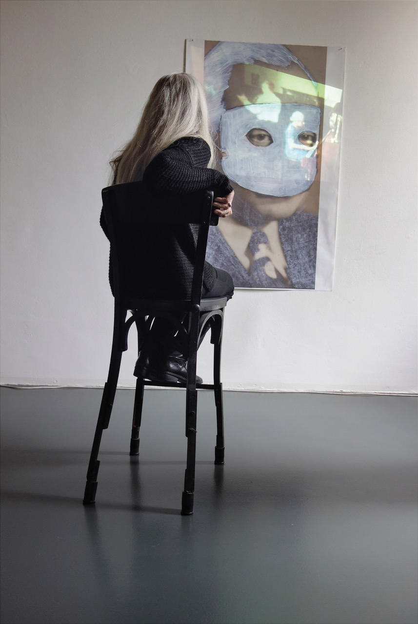
Of course, it is not incorrect to describe Dore O. Nekes, who died in 2022, as an experimental filmmaker. This artist did indeed play a major role in avant-garde cinema, partly in collaboration with her husband, Werner Nekes. But Dore O., who was born in 1946 and studied painting in Hamburg and Perugia, showed from the start of her career that she was unwilling to limit herself to only one artistic discipline. On the contrary: this border-crosser and co-founder of the legendary Hamburg Filmmakers’ Cooperative in the 1960s consciously worked across disciplines, always refining the illuminating combination of diverse media. Cognitive work with ample emotion.
The fact that the image researcher Dore O. was also accepted in the art world early on is shown by her participation in documenta in 1972 with Harald Szeemann and in 1977 with Manfred Schneckenburger. As a young artist, she had begun to develop installation art by combining various image carriers, uniting artworks that stand in space or hang on a wall with art that moves. Plexiglas discs and plastic tubes appear in her work, often overshadowed by projections. But Dore O., whose entire oeuvre is not easy to grasp, was also interested in small formats. Her Polaroids, for example, embody a symbiosis between photography and painting. Danger and destruction meet integrity and healing.
These artworks accordingly always imply the situation of a world that needs readjustment between stagnation and awakening in the spirit of the 1968 movement. What the Deutsche Kinemathek has recently achieved with regard to the restoration of her cinematic legacy would now also be desirable for her interdisciplinary oeuvre as a whole, namely: a cataloguing of the collection.
Although fellow students who studied painting with him in Berlin in the 1960s still worked with paint and brushes, Frank Oehring, who was born in 1939, was already boldly using new materials at the time. This painter and sculptor favoured acrylic glass and neon light to create sculptures that were soon also appreciated by musicians, who felt that his spatial objects complemented their electronic compositions. From then on, Oehring created electronically controlled light artworks. One of his first major commissions, realised in the ICC in Berlin, was a guidance and information system and simultaneously also an impressively pulsating light sculpture nearly ten metres in height – the control centre, so to speak, of an unusual artwork to accompany a building.
Oehring, who has realised countless works in public and semi-public spaces over the past decades and who has also always been active as a bringer of light and inserter of signs into private spaces, is one of the experts of an art of light and architecture that is committed to people. This artist, who also sees himself as a designer, explores existing conditions and develops the new from current needs, yet without betraying his artistic ideals. Applied art in a free environment.
Frank Oehring increasingly worked with natural light from the late 1980s onwards, so that painting, which he had temporarily neglected, again became an integral part of his oeuvre. Though he seems to prefer aluminium to canvas and likes to rely on the principle of backlit radiation, this artist increasingly saw opportunities to dispense with energy from a battery or wall socket and to play only with the natural changes of daylight in the interests of sustainability, which has become unavoidable nowadays. No doubt about it: Oehring is truly a contemporary artist.
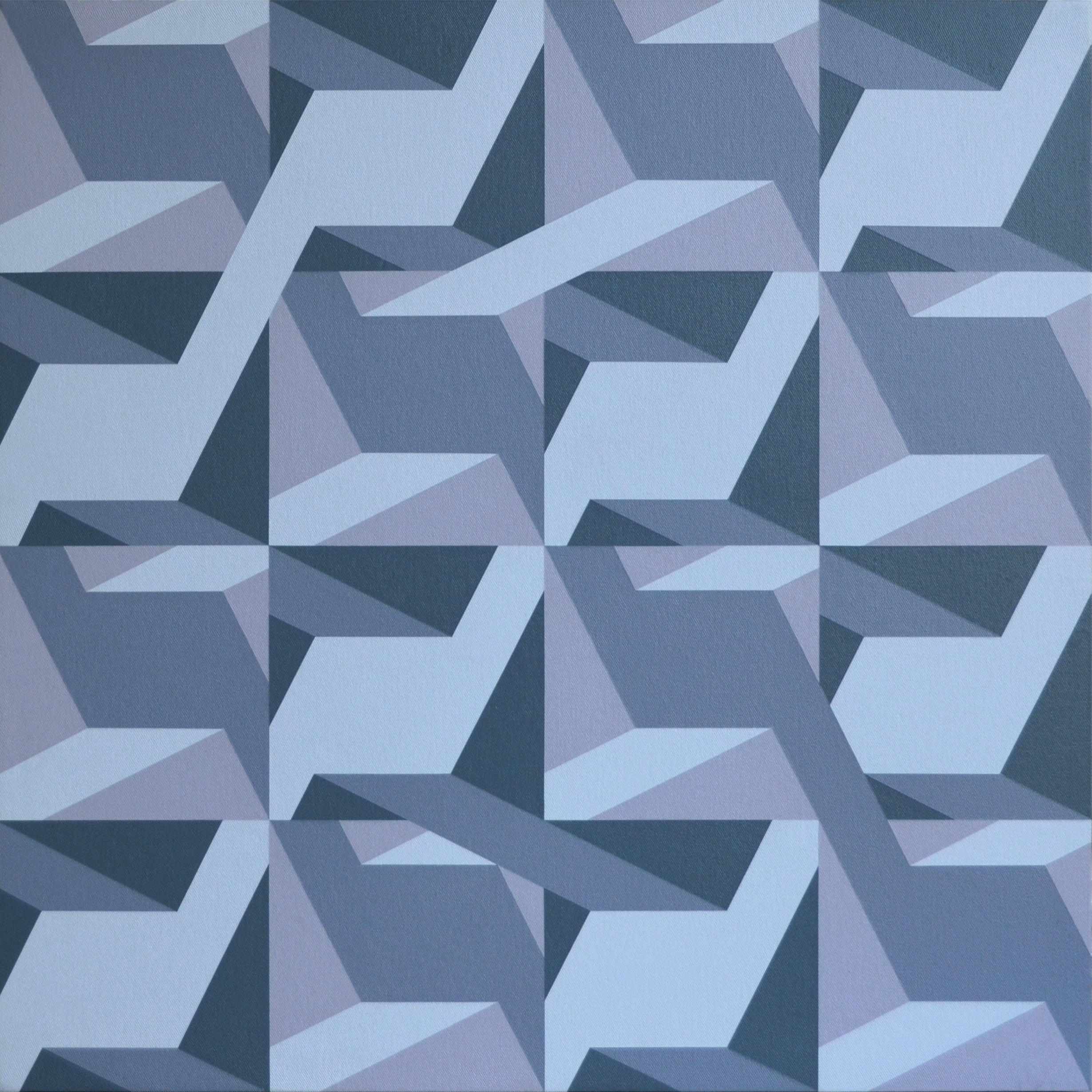
Colour and form, surface and body, time and space: Karin Radoy, who was born in 1957 and trained as a painter in Offenbach and Frankfurt am Main, deals with the classic concepts of fine art and, thanks to her concentrated work dedicated to pictorial research, seems to be one of the quiet protagonists among the creative people in this country who are content to resist the temptations of the market. But anyone who takes a closer look at this artist’s paintings will soon realise that she is indeed working in an especially problematic area and surely deserves attention, even in the context of her more reserved colleagues in Concrete Art.
Unfazed by changing trends or short-lived fashions, Karin Radoy has had a kind of trademark for a good quarter of a century: she designs so-called “double objects”, which ultimately embody a dialectical principle. The green cannot exist without the blue nor can the large exist without the small, and where one part slims upwards, the other broadens to the same extent. A not B, and C only with D.
Last but not least: The personal painterly gesture is allowed to express itself here with all its inevitably germinating irregularities. At the same time, these wall objects appear perfect, as though they were industrially manufactured and beyond even the shadow of a doubt. In this field of tension, Karin Radoy’s artworks offer space to ponder the nature of painting per se and to pose questions of identity, which are unfortunately all-too-often neglected in a fast-paced era.
The expert Klaus Honnef praises Michael Ruetz, who was born in Berlin in 1940, because this former “Stern” photo reporter steadfastly refused to obey both the conventions of the journalistic profession and the constraints of the art market, thus enabling him to create “an unrivalled photographic oeuvre”. Ruetz studied Sinology, Japanology and journalism and, more by chance than by intention, came to be known as the chronicler of the 1968 generation. An eyewitness of the Soviet invasion of Prague in 1968, he later professionalised his photographic skills under the tutelage Willy Fleckhaus and Otto Steinert in Essen and afterwards taught communication design in Braunschweig.
It is no coincidence that Klaus Honnef has been observing the development of this photographic artist for decades. Although Michael Ruetz has rarely exhibited of late, he undoubtedly ranks among the few camera artists who combine the documentary aspect, i.e. the visualisation of political events, with fundamental questions. Through this combination, Ruetz creates images that bridge the gap to philosophically charged themes. The phenomenon of time occupies a special position in his work, which goes beyond the topicality of each day’s events.
Whether they depict dense throngs of people at street demonstrations or bleakly deserted cityscapes photographed through gaps in fences at desolate building sites, Ruetz’s photos are characterised by formally compelling compositions and send challenging messages about finding solidarity in public space.
Dieter Schosser, who was born in 1955 and died in 2021, initially favoured egg tempera. Later he was content to make art from and with simple objects that he found by the wayside. Schosser painted with coffee grounds and liquid dishwashing detergent and directed his creativity toward humble pieces of cardboard, tea towels or plastic bags, although he had formerly painted on high-quality canvas. His gradual turning to a special kind of Arte Povera was born out of necessity for this artist, who was in poor health, and resulted from his realisation that simplicity is the right thing – just as the most important quality in art is discipline, according to the credo of this singular painter, who lived since the 1990s in Friedrichshafen, where he grew up and which he temporarily left to study painting in Karlsruhe.
Dieter Schosser absorbed everything the humanities and the arts had to offer, whether Ludwig Wittgenstein’s philosophy or Japanese Butoh, and he refused to be deterred by quotidian obstacles. “Schosser lived regardless of losses”, wrote the critic Michael Hübl. An independent spirit who neither made nor sought excuses, his workplace was art. From morning till night, he cultivated an inner drive to pursue his diverse interests and radically filter out all inessentials, leaving only what was valid for him as an artistic proposition. An apparition, an omnipresent one, as one obituary puts it.
Yet Schosser, when he was still focussing on the use of egg tempera and canvas, lived strictly in pictorial reduction. Circle, triangle, square: these were the basic formula. His penchant for vivid, saturated colours remained until the end of his career, which nonetheless spanned a diverse spectrum of styles and artistic gestures. The main thing is the signal character, which, in this painter’s mind, is probably the ultimate prerequisite for being recognised.
Before studying painting in Munich, where he graduated as a master student of Ernst Geitlinger, Veit von Seckendorff, who was born in 1937 and made his home in Nauheim, Hesse, spent several years in the 1950s studying surveying technology. This was surely an ideal prerequisite for bringing to his canvases a variety of constructivism that this artist perfects by seemingly directing it beyond the boundaries of the picture plane and into the surroundings. Geometric impulses extend themselves mentally, activating their immediate environs.
Viewers suddenly find themselves in “a school of seeing”, as the artist likes to say. This cognitive task simultaneously arouses a tremendous desire for colours, forms, grids and rhythms. It is no coincidence that one of this painter’s role models is the Dadaist Hans Arp, who died in 1966. The subtlety and humour that played a central role in the Dada movement, which was founded over a hundred years ago, is likewise characteristic of Veit von Seckendorff’s work.
A watercolour and ink drawing such as “Na so was”, ultimately a caricature, clearly shows that this artist has no fear of contact. While the painters and sculptors of Concrete art in particular are usually quite puritanical and avoid representationalism, von Seckendorff regards figurative representation as a perfectly opportune way to expand his pictorial cosmos. This is also demonstrated by acrylic paintings and drawings such as “Blick-Kontakte” (2011) and “Ansichtssache” (2012).
Delicate lines condense to form a seemingly seismographic membrane. Using egg tempera and oil on canvas, sometimes rubbed in with her hands, Regina Sell creates landscapes of colour and relief-like structures that are simultaneously evidence of an inner state. Authentic documentations of a momentary frame of mind, a confrontation between height and depth, between groundedness and the need to rise, to take off, to disappear into the firmament.
Born in 1958 and trained at the Stuttgart Academy under Rudolf Schoofs, the Berlin-based artist Regina Sell moves between “graphic painting” and “painterly drawing”, as Gabriele Uelsberg aptly characterised her oeuvre. The painter herself is primarily concerned neither with medial categorisation nor the appeal of formal changes of direction, but with an approach developed from her personality – and with the invitation to participate (Uelsburg) “because the process of the pictures is unfinishable”.
Apropos personality: It is noteworthy that this painter prefers a colour palette characterised by black, brown and diverse earthy tones. Although a bright ochre or fresh yellow variant occasionally pops into view, the achromatic predominates here. To put it plainly: This artist creates natural spaces, places of retreat that are simultaneously also places of new beginnings.
Daniel Thurau studied under Werner Büttner and Jutta Koether at the HfbK in Hamburg, from which he graduated in 2013. Despite favourable career prospects, things soon went quiet for him. After initial successes, Daniel Thurau, who was born in 1974, disappeared from national attention, although friends and collectors observed his further development with great interest – especially because this painter did not take a direct route to art, but came to his paintings via the detour of studying law.
His continuously growing oeuvre, primarily paintings and works on paper, is figuratively orientated. His is an expressionist style, as adapted by the so-called Neue Wilden in the 1980s. Nevertheless, Thurau has developed his own narrative pictorial language, which can be situated between profane and religiously valorised figuration. A halo occasionally appears in these compositions, just as naturally as two people standing bored beside a high table in other pictures. A visual world full of allusions unfolds between chic party and high mass, credibly staged thanks to the painter’s personal experiences and observations.
Daniel Thurau’s worthiness for rediscovery may also have something to do with the fact that the most diverse motifs are closely linked in his oeuvre, in which the common denominator is the mood captured in these pictures, even the supposedly cheerful, brightly coloured ones. This artist, who doesn’t seem to take the easy way out, also conveys hope and a longing for paradise, despite all the obstacles along the way.
Born in Catalonia in 1937, Josep Vallribera belongs to a generation of artists who see themselves as the avant-garde of innovation. This 86-year-old painter, draughtsman, sculptor, photographer and performer, who was already closely involved with art as a child and later co-founded a gallery together with his father, is continually in quest of new forms through which to fathom the mysteries of life.
Although he has always centred his life on Ibiza, where he attended grammar school and subsequently got to know countless artists (including Antonio Saura, Emilio Vedova, Corneille and Heinz Trökes), Vallribera is ultimately regarded as a restless spirit, a globetrotter who draws his artistic inspirations from everywhere.
Vallribera has lived in Denmark, Germany, France and Austria, and his artworks show that he prefers to remain stylistically open. A wide variety of influences from different places of residence and areas of experience come together in an oeuvre that defies categorisation in the neatly defined pigeonholes of art history. While most of his colleagues cultivate their unmistakable handwriting, Josep Vallribera continues to enjoy the adventure of being guided solely by content. He can live with the risk that a Vallribera is not immediately recognised as a Vallribera.